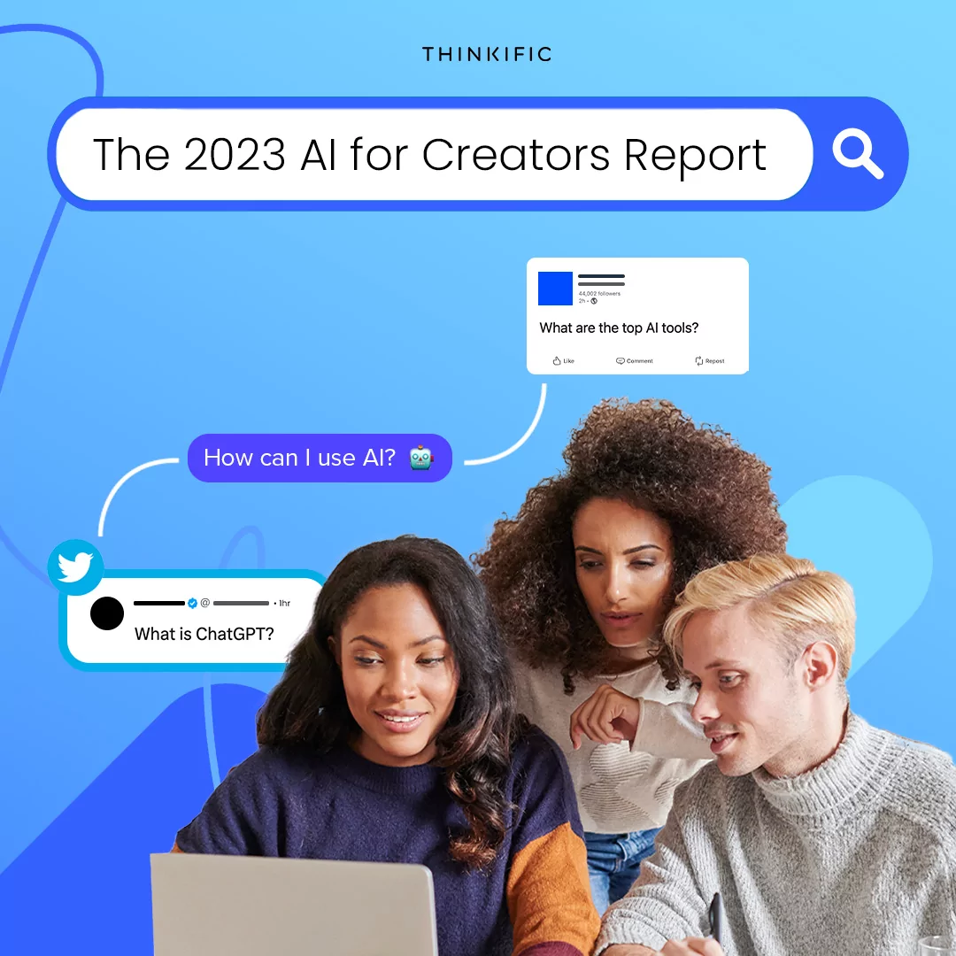


You’ve spent countless hours building your online course ensuring it can deliver the biggest impact for your students. As an expert in your industry, you know that you have developed strong content to help them reach their goals. You also know that your students aren’t going to just magically sign up for your course. They need to be convinced that your course is worth their time and money. This is why you need a landing page.
A landing page has only one objective
A landing page is a standalone page designed for one purpose: to compel visitors to take a specific action. If the goal of your landing page is to sell your online course, for example, the success of your landing page is measured by the conversion rate from visitors to customers.
One example of a landing page is the well-known sales page. These types of landing pages use design elements such as compelling headlines, visual cues, and social proof such as testimonials and customer logos to convince visitors to convert into customers.
The difference between online courses that sell and ones that don’t isn’t always the course content. Landing page design can play a major role in your conversion rates. If your landing page isn’t optimally designed, you won’t maximize the number of sign ups for your course. On the other hand, an online course landing page with a strong design could help you sell more online courses and reach a larger audience of students.
Finding the right mix of elements on a landing page isn’t easy, which is why designers are constantly testing new ideas. You might have to A/B test several different versions of your landing page before you discover what works best for your audience.
More of a visual learner? Check out this video on how to create an effective sales page:
The 9 Elements of a High Converting Landing Page
After reviewing countless landing pages and design templates, I’ve identified 9 critical elements of great landing page design. I’ve listed these elements below, along with examples of landing pages that have used each of these elements effectively.
1. Main Headline
When visitors arrive on your landing page, the first thing they’re likely to notice is the headline. Effective headlines clearly state both the offer and your unique value proposition. Your sub-headline should fill in the blanks by adding in additional key details.
When a prospect lands on your page, if they see a headline that is confusing or doesn’t seem relevant, they will likely bounce immediately. Make your headlines clear and concise, so your prospects know exactly what the landing page is about as soon as they arrive.
The headline below from Skinnyfitalicious immediately announces what the course is about, and the unique value that it offers prospects. The sub-headline goes into greater detail about the specifics of the course:

2. Eye Catching Image
A well-designed landing page leverages quality images to convince prospects to convert. Landing pages with images of people smiling tend to convert at higher rates.
Landing page design can also play on human psychology to get visitors to look in the direction of an element that you want to draw their focus towards. For example, a designer might use the deictic gaze to compel a prospect to look towards the CTA. The deictic gaze is the theory that humans tend to look at objects that other humans are already looking at. If there is an image of someone looking at the CTA on the landing page, the prospect will likely do the same.
This USC landing page uses deictic gaze to draw attention to their form:

Let’s take this landing page example from West Coast University. The arrow pointing towards the form as well as the arrow on top of the form are visual cues, allowing designers to direct the gaze of prospects where they want it to go: both the form and CTA button:

3. Compelling Copy
Is your landing page copy readable? Is the font legible? Using an artistic font might seem stylish, but if your prospects can’t read your copy, the messaging will be completely lost. Choose a font that doesn’t make your visitors squint.
Take this landing page example from Lion’s Roar. The font is clear and legible throughout, making it easy for visitors to read:

4. Urgency
Urgency isn’t something that comes to mind when you think of how you want your landing page layout to look. But it can be a highly effective element for convincing your prospects to convert. Adding terms like “now,” “limited time offer,” and “act today” can all compel sign ups.
Look at how this Treadimi landing page uses urgency to compel prospects to act quickly saying “offer available in July only” and using the CTA of “Buy Now”:

5. Money-Back Guarantee
Trust is a critical component of compelling your prospects to convert. If prospects don’t trust you or your brand, they most likely aren’t going to buy from you. A good way to encourage prospects to trust you is with a money back guarantee.
Write to 1k places their 30-day money back guarantee above their payment plans and CTA. Placing trust indicators near the CTA is an excellent way to instill trust right before conversion:

6. White Space
Have you ever walked into a cluttered room and found it difficult to find what you were looking for? A landing page without white space can feel the same way to your prospects. White space helps to clarify relationships between essential elements and can improve comprehension for visitors.
White space doesn’t have to be white. It is simply negative space that is void of content or landing page elements. This Dr. Hyman landing page uses white space for his Eat Fat, Get Thin Course. Visitors can clearly comprehend and focus on each element:

7. Sign up Form / Call-To-Action (CTA)
Many designers trying to sell courses online won’t have a lead capture form and will instead focus entirely on the CTA. If you do use a form, be sure to only use a minimum number of fields. Increasing the number of form fields increases the amount of friction, meaning that your prospects will feel overwhelmed and will be less likely to input their information.
A strong CTA does two things: leverages a color that is distinct from the rest of the page and has personalized compelling copy. When you see a CTA that only says “submit,” you likely aren’t going to be moved to act. But a personalized CTA can push prospects over the top to convert.
This landing page for Hootsuite’s Social Media Marketing Academy is a good example of a CTA that stands out from its surrounding elements and uses personalization to convince prospects. “Get Certified Now” is CTA copy that will compel more prospects to convert:

8. Decoy Effect
When pricing your online course, you want to direct visitors towards your preferred pricing option. This can be done with a little help from human psychology in the form of the decoy effect.
For example, if you are offering three different plans for visitors to choose from, the decoy effect prices a contrasting option in an extreme way to make the other plans seem more reasonable.
Gaia offers online yoga and meditation programming. Their plan selection page has three options: 3 months for $20, a monthly plan for $9.95, and an annual plan for $95.40. The third plan is priced annually instead of per month, but the shock of seeing such a high price makes the other two options seem much more reasonable. That is how the decoy effect works:

Related: How to Price Your Online Course (Complete Guide)
9. Trust Badges & Social Proof
Trust badges and social proof are elements that help inspire trust in your brand. When prospects trust your brand, they feel more comfortable buying what you have to offer. When prospects don’t trust your brand, they are likely to take their business elsewhere.
Trust badges can be anything from detailed testimonials, an icon indicating your business is accredited with the Better Business Bureau, to customer logos that show major brands who currently buy your services.
Social proof shows prospects that other people are using your services, — anything from testimonials, a counter with the number of enrollees in your course, or industry awards.
Autopilot uses testimonials as social proof for their marketing automation software. The quotes are detailed, and the testimonials come with a personalized photo and title, making them highly persuasive forms of social proof. The photo, in particular, makes it easier for visitors to make a visual connection with people who have used your service.

Design a landing page that motivates visitors to take your course
A poorly designed landing page can cause your prospects to lose interest before they even read about your course content. After all the hard work you’ve put into designing your course, you don’t want a lack of whitespace or a bland headline to scare your visitors away.
Optimizing your landing page with strong social proof or a CTA that stands out will improve the chances that your prospects will be motivated to take your course. Be sure to test out different elements and see what works best for your audience.
Did these landing page examples show you how you can influence your prospects with the right design? Which elements will you use to sell your online courses? Let us know in the comments!
9 Critical Elements of High Converting Landing Page Design @findingpeace @Instapage Click To TweetTwila Liggitt is a Content Writer & Editor for Instapage, the most-advanced landing page platform for teams and agencies. Her specialties include digital marketing, content marketing, and writing about her agency experience. When she’s not working, she enjoys travel adventures, food/wine tasting, and reading literary masterpieces. Say hello on Twitter!
This guide was originally published in 2017, and was updated in August 2023 with more information.